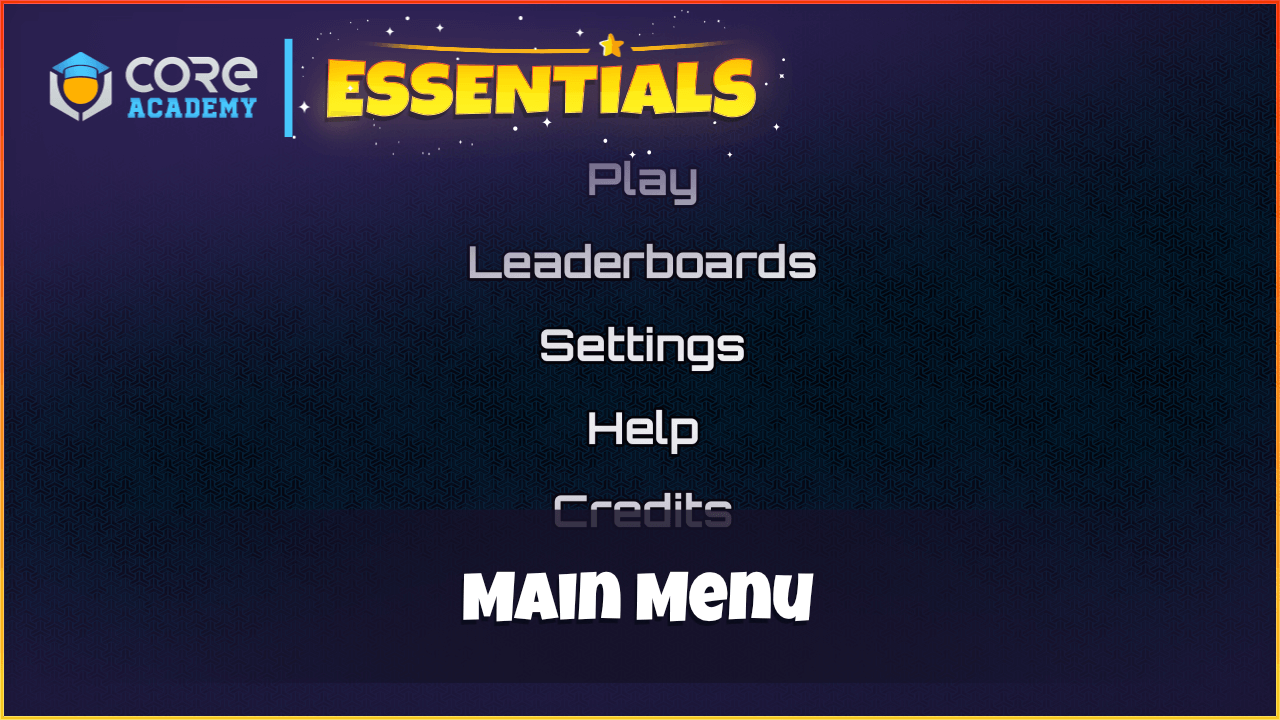
The Main Menu gives creators a very simple way to create the main menu for players that shows up when loading into the game.
The component is simple to use and requires no scripting knowledge to use.

How to use
Drag the Main Menu component into the Hierarchy.
There are various custom properties on the root of the template.
- MenuOffset
Offset between each menu item.
- EnableCursor
If enabled, then the cursor will be visible when the menu is open.
- NormalColor
Menu option color.
- HoveredFontColor
Menu option color when hovering over it.
- NormalFontSize
Default menu option font size.
- HoverFontSize
Hovered menu option font size.
- FadeInSpeed
The speed the menu fades in.
- FadeOutSpeed
The speed the menu fades out.
- DisableMovement
If enabled the player will not be able to move until the menu is closed.
Creating Menu Panels
In the UI Container in the Hierarchy, there is a Panel that contains all the panels that can be opened. These can be styled to how you want. To close a panel a close button is required. See the default panels that come with the component.
Creating Menu Options
To create menu options, you will need to add them to the Main Menu data table in project content.
- Text
The text to display in the menu.
- Panel
The reference to the UI panel for this menu option to open.
- Event
The event to broadcast when the menu option is clicked.
- CloseUI
If enabled, then the menu will close when this option is clicked.


Pingback: Core Academy Essentials - Core Academy